-
Architects: HAO Design
- Area: 36 m²
- Year: 2016
-
Photographs:Hey! Cheese

Text description provided by the architects. This project is a multipurpose space that combines a studio and exhibition space featuring furniture for sale. The property, a unit in a row of old townhouses, is located in Kaohsiung City's Zuoying District. The 36 year-old house has a retro, warm and inviting exterior and retains the split-level floor plan popular in the 1960s. Past occupants have made additions according to their needs, including a sheet metal shack and windows with iron grating.

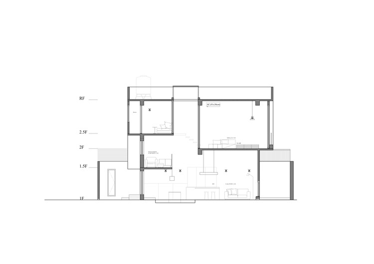
The first floor of the building is 11 ping (approximately 36 square meters). It has a narrow facade and hence the interior does not let in a lot of light, obscuring the building's original beautiful exterior. We removed the interior staircase, the iron grated windows facing the street and the sheet metal shack (which was a kitchen) added to the back of the first floor. We spruced the space up by adding exterior stairs and a courtyard, in order to let the old house regain its original style and charm.


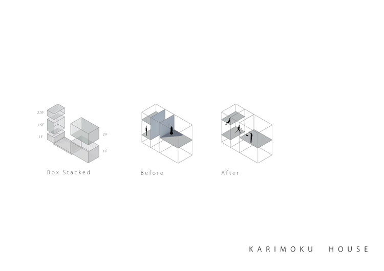
The space was originally designated as a studio and exhibition space for Japanese furniture, but because of the floor plan, the building's three rooms were all separated by solid walls and blocked by staircases. The entire space was fragmented and incoherent. First, we removed the solid walls separating the staggered floors and moved the stairs outdoors to expand the interior space of the structure so that light from the courtyard can enter. We expanded the space by using glass which allows light to penetrate freely, thus improving interactivity. Now, each space can interact with their neighbors. In order to highlight the beautiful characteristics of the townhouse, such as the circular chamfer of the windows, we used the color white as our base to create a clean, uncluttered space for exhibiting furniture.


As for the stairs, they are now the only thing connecting the individual floors. In order to add something new to climbing up and down stairs, we added a slant to the French windows on the second floor so that people will step on a triangular platform when they move outside via the exterior stairs. This also creates a livelier facade. The path through the house is strung together by the exterior stairs so occupants and visitors weave in and out, enjoying the excitement of exploring all the various boxed spaces.
Originally published on March 29, 2017


